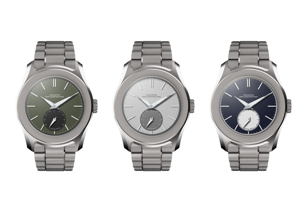
In this series of articles, I will take you on the adventure I embarked on to start my own watch brand this year. In those previous episode you could read about the concept behind my watch, the VPC Type 37HW, and how top designer Max Resnick turned it into a design. In this edition, I share more about the technical development that follows the aesthetic design phase.
Text: Thomas van Straaten
Designer Max Resnick naturally takes into account the intended technical specifications when drawing a watch. For instance, he will obviously not design a watch that is 5mm high, when we know that it is to house a 4.5mm thick movement. He designs the watch around the intended calibre and also already takes some account of, for example, the desired water resistance.
 From external design to technical design
Yet in the first phase, he focuses mainly on the look of the watch. What should the watch look like in the perfect world? You can compare the result to a concept car at a car show. The intended aesthetic is shown, but it does not yet meet all the safety, comfort and environmental requirements.
I therefore took Max's drawings and my technical wish list to a Swiss party that is doing the technical development. To qualify for the Swiss Made designation this development should take place in Switzerland. This party will also support me in finding the right manufacturers for all parts. Eventually, they will also take care of the assembly, control and, eventually, servicing of the watches.
 Technical properties
My VPC Type 37HW should be a classic hand winding, combined with the safety of a screw-down crown. This is quite a challenge, because if you wind the spring to its maximum, you cannot turn any further to screw the crown shut. Automatic winders have a clutch that ensures you can keep turning the crown at all times. Hand winders do not have this clutch, so you can feel when you have fully wound the spring.
Fortunately, I am not the first to combine these features. The Panerai Radiomir is the best-known example of a handwinder with a screw-down crown. Like Panerai, we use a mechanism that disconnects the crown from the winding mechanism when you press it. This way, you first feel that the spring is fully wound and then you can still screw the crown to the case. We use a top-grade Sellita SW216-1 calibre for this, which we also adjust to chronometer specification and have certified.
This crown is part of a number of features that should ensure water resistance of at least 100 metres. This in turn brings its own challenges. Namely, the aim is to keep the watch under 10mm thick. So that's considerably slimmer than comparable watches like the Rolex Explorer and Omega Aqua Terra. Water resistance, however, is largely determined by the rigidity of the materials. The case cover, for example, can deform under very high pressure, breaking the water resistance. Or the glass can crack, with the same result. It is therefore a matter of finding just the right balance. The steel case cover and sapphire glass must be exactly thick enough to handle the required 10 bar, but no thicker. Otherwise, we lose the strikingly slim profile of the watch.
 Technical development
Right now, the aesthetic design is being aligned with an endless list of wishes and requirements like those above. Technical drawings are being made that will soon be used by the various manufacturers for production. As you can understand, this listens rather closely. Parts from different suppliers must soon come together in perfect harmony. Just one mistake needs to creep into one of the countless processes and the watch will fail. Sharpness is therefore required. Continuously!
During this phase, we also identify the desired manufacturing partners. Who is the most suitable candidate to manufacture our milled dial? Who can produce the strap at the required level of quality? This is a challenging process because the Swiss watch world is quite closed and discrete. As a Dutch outsider with a tiny new brand, I do not exactly enjoy the highest priority. So some diplomatic dexterity AND insider help is absolutely crucial.
 3D renders and prints
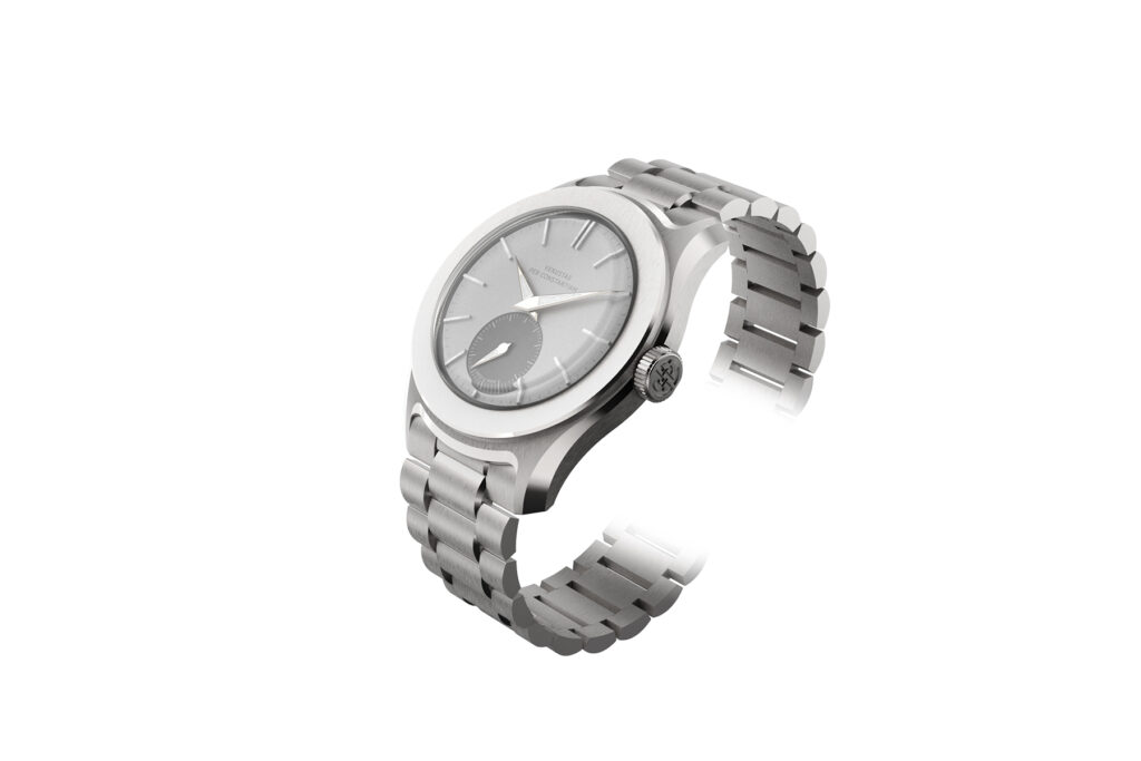
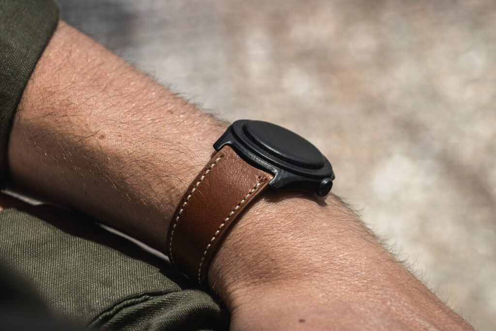
You may have noticed that the images of the watch are considerably more detailed than in the first article on this project (in GW #85). Designer Max Resnick has created a series of 3D renders so that I can already give my followers a somewhat more naturalistic view of the watch. But we are not just using the 3D models for promotion.
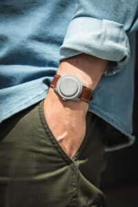
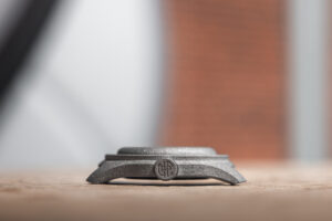
In fact, we also 3D printed the case in plastic and even steel. This allowed us to thoroughly test the watch's fit. The aim was to give classic proportions yet a solid 'wrist presence'. To achieve this, we ended up with a diameter of 37.5mm, combined with a relatively slightly longer length of 45mm. This combination gives the watch an almost neutral fit. It is really right in between a Rolex Explorer 36mm and 39mm in terms of feeling on the wrist.
We made several 3D prints, carried them and used them as input to further refine the design. As a result, the final case is also quite extremely curved. As such, it follows the curve of the wrist for a very comfortable and stable fit. Most watches rest on the case cover when laid flat on a table. Our Type 37HW stands on its feet because of this extreme curvature.
 An entirely unique font
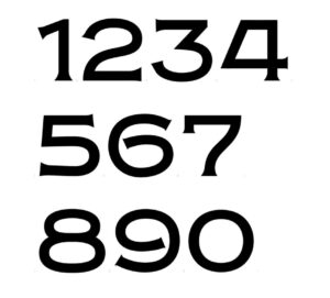
As a nod to the rich history of the wristwatch, I wanted to revive the old dial typography. Many brands today use Arial font on the dial. Just look, for example, at the text on the dial of the new Tudor Black Bay 54. Nothing wrong with that, of course, but I wanted to capture the charm of vintage watches. And fonts are of great value in that.
Designer Samuel Baker went to work for me. He studied countless old Omegas, Rolexes, Pateks and other watches to unearth the peculiarities of these classic fonts. He then created an entirely new typeface exclusively for VPC!
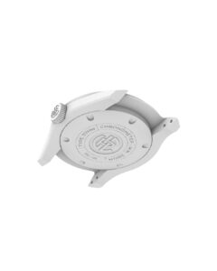
This typeface contains all the typical features seen on watches from the 1940s to the 1970s. The A and 4 with flattened top, the crocheted 7, the unfolded S and of course the sharp, pointed serifs on all characters. This unique font proudly adorns the dial of my watch. Both the brand name and the ''Swiss Made' signature are executed in it. The specifications on the case lid are also engraved in this font.
 Details, details, details
It may sound extreme to develop an entirely new font for a watch. For me, however, this constitutes the raison d'être of my brand, VPC. Because only by going beyond existing brands can I create a niche for my watch. And this extreme focus on details is also necessary to bring development and production to fruition. 'Swiss precision' is certainly not an empty term when trying to develop a new watch. Next time, we will see if we also managed to find the right manufacturers to really bring this dream watch to life....
You can follow the development in real time on Instagram: @vpc_watches


