Normally I write for Gentlemen's Watch about existing brands. Today, however, is a special day. For today, the objection period against the trademark registration of VPC Watches expires. This means that from today I am the proud owner of my own watch brand: Venustas Per Constantiam. In proper Dutch, that roughly translates as "beauty through restraint", which gives you an immediate insight into my intentions.
Text: Thomas van Straaten
Now, there is quite a lot involved in setting up a watch brand and developing a debut watch. It is, to say the least, quite a learning journey. And that is exactly why I decided to share my journey openly. The watch world mostly works behind closed doors. You never really get to see how a watch is developed. Until now. In a series of articles in Gentlemen's Watch, I will take you along as I am doing it myself. In this first article: the ideation and concept design phases.
The ideation phase
In my years as a vintage watch dealer and later writer, I have owned endless watches. Although I have been dreaming about my own watch brand for years, it turned out I really needed all this experience first. Indeed, gradually an imaginary dream watch formed in my head. With every watch I tried on and thought "So beautiful, but if only they had...done it", my dream watch became a little sharper in my mind.
I used to come up with concepts for new watches, but they were always just too obviously derived from something existing. That's not what I wanted, it had to be original. So the plans went back on ice each time. But as the years passed, the list of dream features got longer and more detailed. I asked myself, "Could this work?"
I also got to know Tom van Wijlick, who had previously revived the historic brands Airain and Lebois & Co. His success story motivated me to give it a try. In doing so, Tom has also been extremely generous with his knowledge and experience to help me along the way.
The idea
My dream watch would have to be an all-rounder, in the spirit of the Rolex Explorer and Omega Aqua Terra. That is to say: sporty formal and formal sporty at the same time. A watch with which you can make a good impression in the pool as well as at the opera. It should also have a classic size, around 36 to 38mm. A steel strap was also a requirement, but with the option of changing to leather, rubber or NATO.
Of course, the above watch has long existed in countless variations from countless brands. I myself have a fine King Seiko SPB279J1 that fits this description. Longines has the Spirit and Tudor the Black Bay 36. But my dream watch was a classic hand winding, with matching slim case. And I wanted a so-called one-eyed panda dial, or a small seconds subdial at six in a contrasting colour. In addition, my dream watch had a flat, vertically brushed bezel like a Patek Philippe Nautilus, but round.
I also had a few technical issues that I missed in many existing watches. For instance, I am rather critical of poorly executed endlinks. The vast majority of steel bands are attached to the case via a somewhat awkward-looking endlink. I wanted my watch to look like it had no endlinks at all. Somewhat like the strap of the new Breitling Navitimer seems to run uninterrupted through the case. So I had dozens of other wishes, which in my mind had to be brought together in my ultimate watch. And if this is my dream watch, I thought, then maybe there are more people who feel the same way. Time to get to work!
 Finding a direction
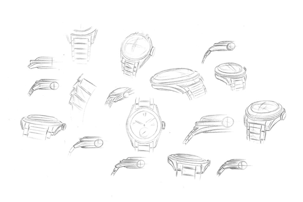
The first step was to hire a top designer. You can go straight to a manufacturer with your concept, but I wanted more creative freedom. I chose England's Max Resnick to bring my dream watch to life. Although my original idea and subsequent design brief were quite detailed, Max still had a lot of room to manoeuvre. You can approach the all-rounder genre from the formal angle, for example, or from the sporty angle. Max sketched out a lot of rough ideas to gauge where I wanted to go.
In these first sketches, you can see him playing with different case profiles and bands. You can also see different translations of my flat bezel. The height and width of the bezel largely influences how sporty or dressy the watch looks.
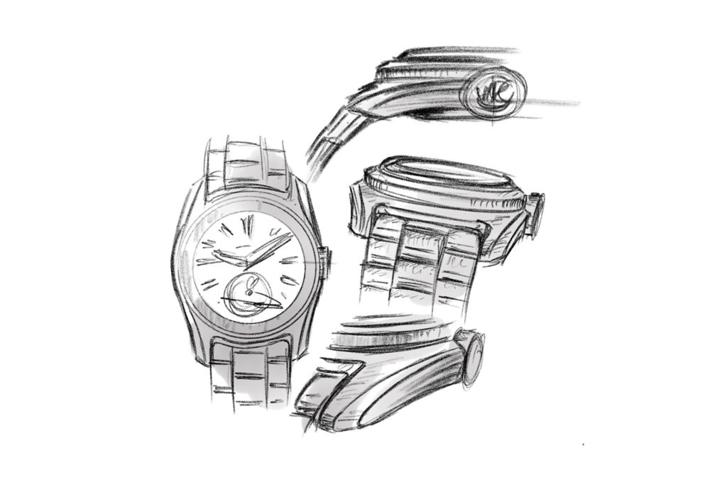
This was followed by some more elaborate sketches. Here you can see the version I immediately hit on. This sketch contained a more muscular cabinet with an interesting round shape between the cabinet legs. It also includes a very clever solution to avoid the aforementioned ugly endlinks. As you can see, Max added a bezel at the strap attachment, which acts as a kind of tunnel for the strap. So the endlink does not come up against the case, but dives under it, so to speak. This allows the endlink to remain as flat as the strap itself, and you don't have to make an awkward jump to the case.
From ideation to concept design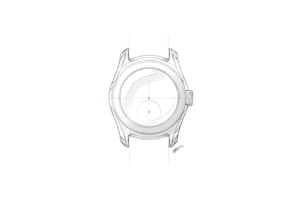
I asked Max to explore this direction further, which resulted in the above elaborate drawing. At this point, I became particularly excited. The edge and the resulting unique cabinet profile contain all the ingredients to form VPC's design DNA. In my view, it is an absolutely unique shape without looking far-fetched or forced.
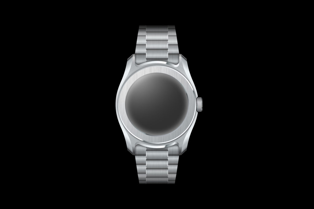
The next step was to develop the sketches into a concept design. At this stage, the look is refined and defined, without still being too concerned with the technology. We also added a steel band that emphasises the shape of the case. This will "dip below the bezel" with a three-part endlink to give the illusion of uninterrupted continuity.
The dial
We saved the dial until last. Just as the eyes put the soul into a painting, the dial does for a watch. If you start with that, the case and strap automatically look better, which often prevents you from developing them to their full potential. So only when we were completely satisfied with the case and strap did we start working on the dial.
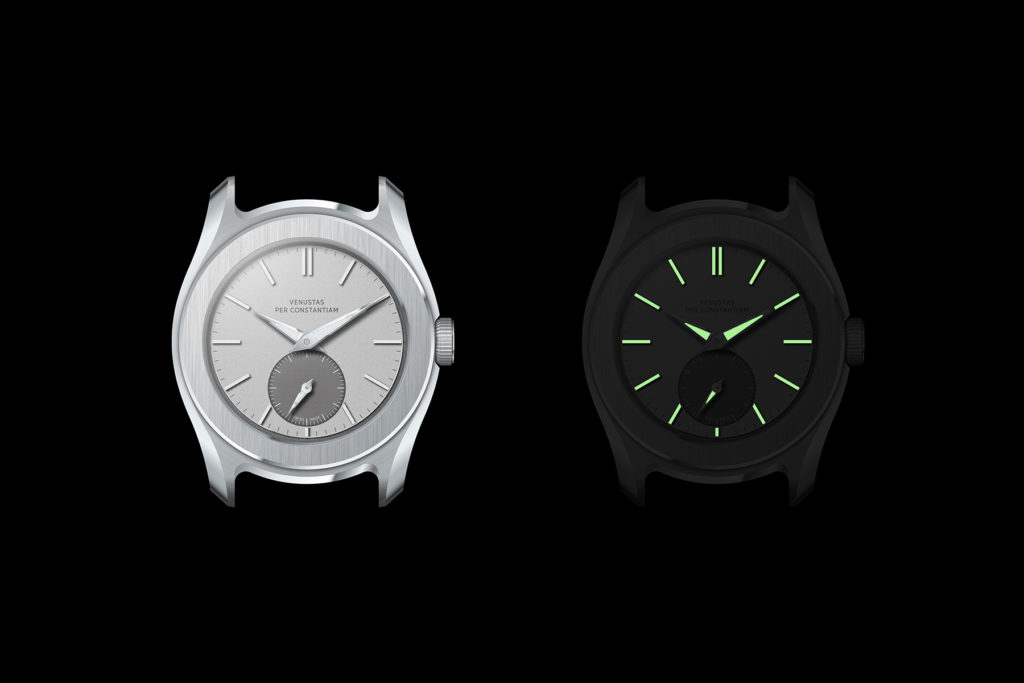
We have implemented the one-eyed panda idea in a subtle contrast of silver tones. This is the base model, but we will add variants in other colours. We also have slim indexes made entirely of lume, as known from the Tudor Black Bay Pro. The handset is a classic dauphine style, with a sleek cut-out for the lume.
Otherwise, we have mainly tried to keep the plate sober. The beauty has to come from subtle details, such as the narrow pie-pan border and the textured surface. We have kept text to an absolute minimum.
The next step
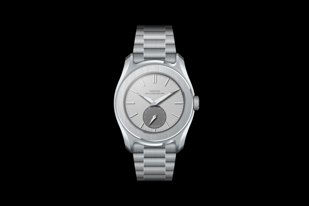
Above, you can see how all the elements come together in our concept design for VPC's debut watch. Now we will start 3D modelling and technical design. We will test the fit on the wrist through 3D printing and tackle a long series of technical challenge. For example: how do you combine a hand winding and a screw crown? I will share this phase with you in the next article on the project.
If you want to follow developments live, you can do so on Instagram: @vpc_watch


