


It is now about a decade since Tudor launched the Heritage Black Bay. A diver based on vintage watches from Tudor and Rolex. It became a hit. But there is more to it...
Text: Thomas van Straaten
To this day, we see new watches building on vintage designs. Some are direct re-issues, others only slightly inspired by their vintage predecessors. Why is that anyway? And could it sometimes be that almost all watches are vintage-inspired?
heyday of watch design
A watch on the wrist has not been commonplace for very long. In fact, the twentieth century was already well under way when the wristwatch appeared prominently on the streets. And once this development was well under way and irreversible, the Swiss watch industry enjoyed its heyday. The Second World War then accelerated the development of functional, solid watches. It then took until the 'quartz crisis' (1970 to the late 1980s) before Swiss mechanical watches really hit hard times. So the 1940s to 1960s could, with some goodwill, be called the heyday of this industry. Looking purely at watch design, you have to include the 1970s.
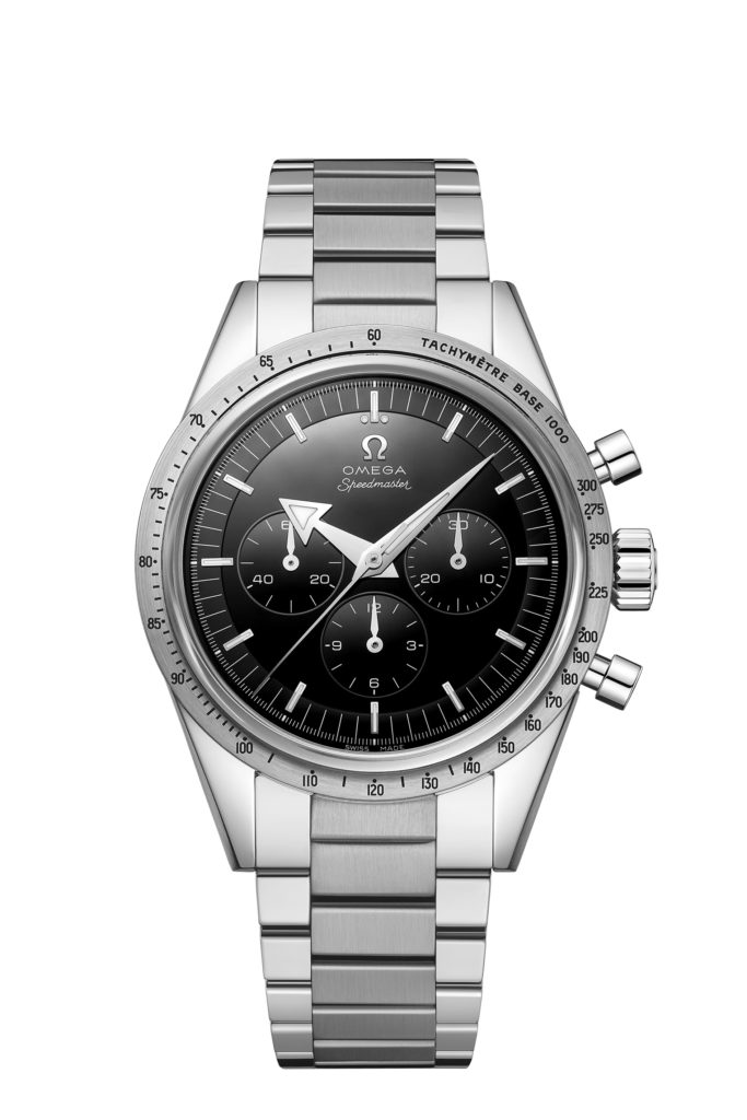
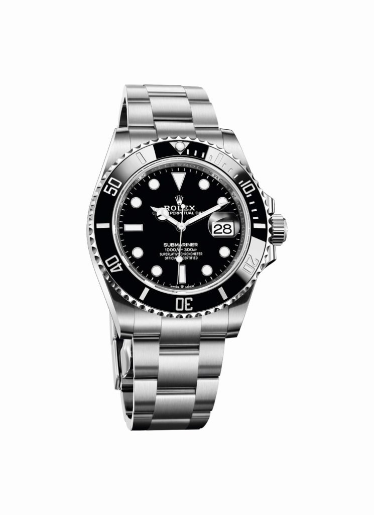
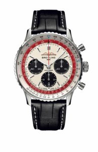
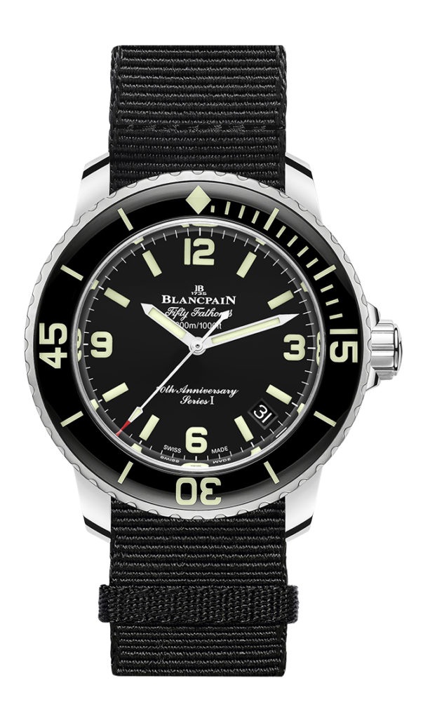
Practically every iconic watch we know today therefore has its roots in this period. We mention: Fifty Fathoms, Submariner, Navitimer, Speedmaster, Datejust, Seamaster, Nautilus, Portugieser, Royal Oak... and we could go on and on. Without exception, these models have subtly evolved over the decades. No brand dares to radically modify such icons. And they are perhaps more beloved today than ever before.
 An optimised design language
You could say that the watch was perfected in the mid-twentieth century. Each niche got its own specialised watches. Everyday watches became more reliable and robust. Practical complications were made optimally readable. Many of the features we now like were developed to optimise reliability and legibility.
 The resulting designs had a purity inspired by functionality. That resulted in the cases, dials, hands, crowns, hour markers and other design elements that we now find quite common. Viewed through that lens, models like the Rolex Explorer and Omega Speedmaster are just about perfect watches. Not surprisingly, the current Explorer and Speedmaster still look pretty much the same as they did back in the day.
Many modern watches have, of course, been technically advanced. More accurate movements, longer power reserves and service intervals, greater pressure resistance and materials that do not or hardly age were introduced. But the appearance of the wristwatch changed remarkably little.
Radically different designs
You may therefore wonder whether it makes sense to deviate from the design language of its heyday. Of course, you can come up with a case shape and a set of hands that have never been seen before. But the big question is: does that make the watch better? Usually, while the result is original, it comes at the expense of function. Sometimes it even looks downright sought-after. As if the briefing was: "Design a dive watch, but try not to think of the Fifty Fathoms, Seamaster and Submariner". That could just result in difficulty.
Every now and then, it succeeds. Consider, for example, the unique visual language developed by F.P.Journe. These watches are completely original and do not resemble anything that existed before. Yet you can see that these designs clearly lean on the language developed in the golden era. In that respect, they could have been designed in the 1960s, only... they weren't.
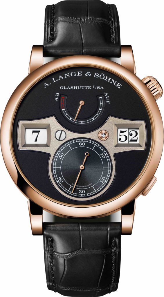 Another great example is the Zeitwerk from A. Lange & Söhne. This watch looks very innovative, and it is. But when you look closely, you can see that it is just a few elements that do not come directly from the golden period. Fonts, case shape, croco strap, hands, colours, textures, it's all familiar. And that's why the modernist, brutalist dial layout with inlaid, contrasting face has such a strong effect. It is sometimes said that the most beautiful music sounds familiar with a little surprise. The Zeitwerk follows that recipe exactly.
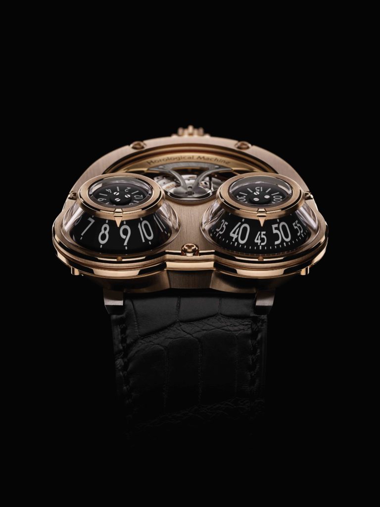 Of course, there are also brands that take the art of timekeeping to another level. Consider the creations of MB&F, for example. These watches, too, are totally original. However, purely as watches, they are no improvement on the standard set in the previous century. While very clever and artful, it comes at the expense of readability and the elegance of the simplest possible solution. You can therefore see this kind of watch more as art than as a practical watch.
Vintage-inspired
So the Rolex and Tudor watches that the Heritage Black Bay was inspired by perfected the visual language of the diving watch. That explains why new Tudors use that language. But that doesn't necessarily make a watch vintage-inspired. The Tudor Pelagos, for example, uses that same language, but is clearly more modern than a Heritage Black Bay.
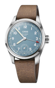
It's the little extras that do the trick. Pop rivets in the strap, gold accents, a domed glass and cream Super-LumiNova. This style has become wildly popular over the past decade. Almost all brands have gone through their old catalogues to bring back the finest models of yesteryear in a new look. And with success. Longines has its Heritage lines, Oris has the Big Crown and Divers' 65 and even Breitling has made its icons a bit more classic again.
It is perhaps the romance of old watches that makes these re-issues so appealing. In a fast-paced world where we must have the latest smartphone every two years, a classic watch represents a kind of resting point. In uncertain times, we like to fall back on a romanticised image of the past. Perhaps vintage-inspired watches are a great example of this.
 Modern is also vintage-inspired
However, what we often fail to realise is that even today's finest modern watches are almost all vintage-inspired. They may not look as vintage as the models mentioned above, but they do use the visual language from the 1940s to the 1970s.
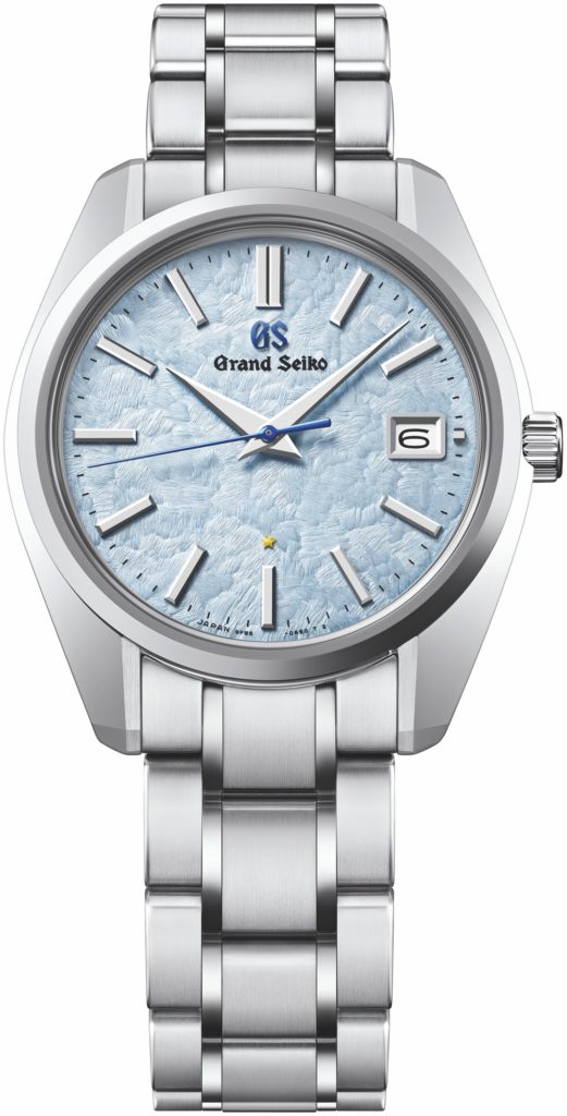
A Grand Seiko 44GS looks state-of-the-art. Yet the case, hands and indexes date back to the 1960s. Of course, a lot has changed. New technologies result in unique new dials. Sizes have been adjusted to modern standards. Finishes have been improved. But the design language has remained pretty much the same. And that makes sense, because that is what we like best as well as what works best. With the exception of the digital watch, there have been few developments that have shaken that concept.
Among vintage enthusiasts, the golden period from the 1940s to the 1970s is widely appreciated. But it is also a crucial era for admirers of modern watches. It gave us the watches we love so much. And it gave us a visual language in which we love to see time represented. We therefore look forward to the new variations that future designers will create based on this fact.