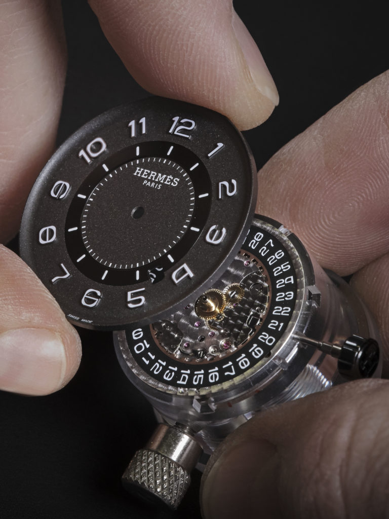
French fashion house Hermès, traditionally famous mainly for its leather goods, is launching a new watch called H08 (from €4900). GW spoke to Philippe Delhotal, the man behind the design
A Hermès watch for which a metal, textile or rubber strap is available, but not a leather one. Explain that.
The starting point for the H08 was a so-called all-terrain watch. The strap suits this purpose of use: it can withstand anything. Moreover, the strap thus perfectly matches the look of the watch -robust, geometric and assertive- and is integrated with the materials used.
The name H08 stands for 'nothing until eternity'. What should we imagine by that?
We wanted to create a modern watch in keeping with the heritage of Hermès. Our vision of 'contemporary masculinity'. A timeless watch, elegant and bold. Not conservative, not a status symbol. Rather a kind of expression of contemporary classicism.
So the 0 and the 8 are two digits that sum up the personality of the watch?
It is a somewhat mysterious name that gives the impression of being in motion but also belonging to time. They are also two numbers that invite mathematical thinking and evoke contrasts, as does the contrast of materials. The idea relates to "nothing mixed with everything", which is also reflected in the shape of the cabinet.
How should we pronounce the name? H-Zero-Eight? H-O-Eight? Or maybe in a French way?
We stick to H-Zero-Huit in French and H-O-Eight in English. But each may decide that for themselves.
 The watch is sporty, stylish and looks very 'young'. What is the target audience you have in mind?
We think of urban, travelling men with an active lifestyle. They like to be where the action is, but also seek comfort and relaxation.
Does the design concept allow for the inclusion of complications, such as a chronograph, for example?
Absolutely. For this new line, we wanted a simple but strong aesthetic. That forms the basis for a complete collection to which we can add complications, play with materials et cetera.
Are the numbers on the dial specially designed for this watch?
Typography is an integral part of our watches at Hermès. This is also the case here. This legible and functional font may not stand out immediately, but it blends seamlessly into the overall design. It incorporates stylistic and geometric elements derived from the case. The 0, for example, matches the shape of the bezel, while the 8 has the same contours.
Not square, not round
History tells us that round watches are more popular -and more successful- than cushion-shaped watches. Is that why the round shape of the dial has been made so dominant within the design?
The strength of this design lies in its square shape that blends seamlessly with its roundness. While undeniably sharp and a little raw, it is also sensual through the curves that blend into the case design, font and mix of materials. We did not take a figurative approach. No references to, typically Hermès, horse riding or a literal shape, like the H for example.
It was more of an abstract geometric exercise. But geometry is also part of Hermès' design vocabulary. The brand likes to play with proportions, shapes and volumes, with the square having a more dominant role.

Can you explain the typical shape of the seconds hand?
On the dial, the seconds are positioned in the centre. You rarely, if ever, see this in traditional horology. The seconds hand is reminiscent of a counter, which enhances the sporty look of the watch.
Which detail in the design caused the most discussion?
Compromises always have to be made when combining aesthetics and technology. That was also the case here. But at Hermès, technology is always at the service of the creation, because we start from the principle that compromises do no good to a design. Our starting point was therefore to come up with technical solutions that respected the design of the model. This was fortunately possible thanks to the integration of expertise, including in case and dial manufacture, within the Ateliers d'Hermès Horloger.


